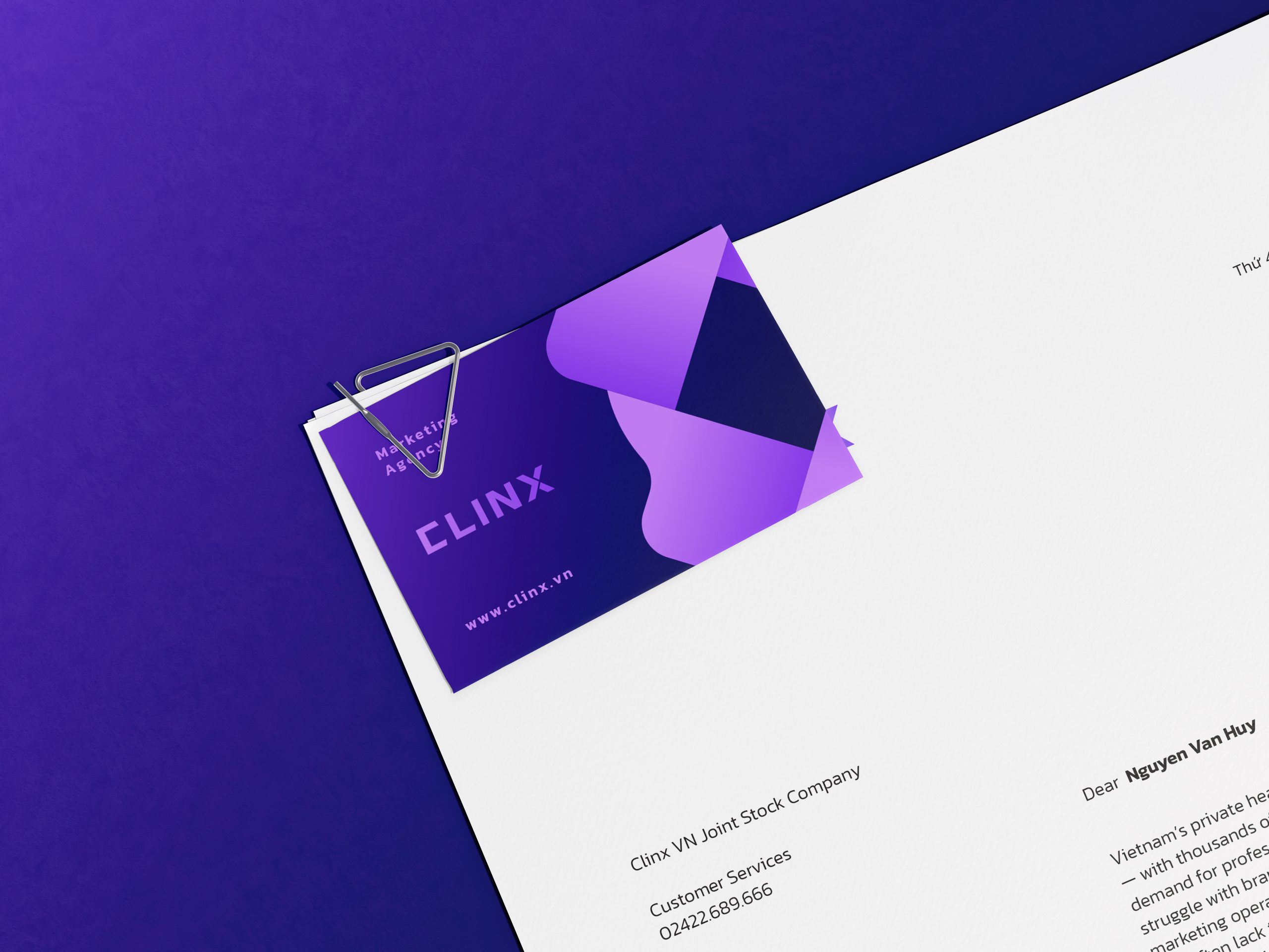
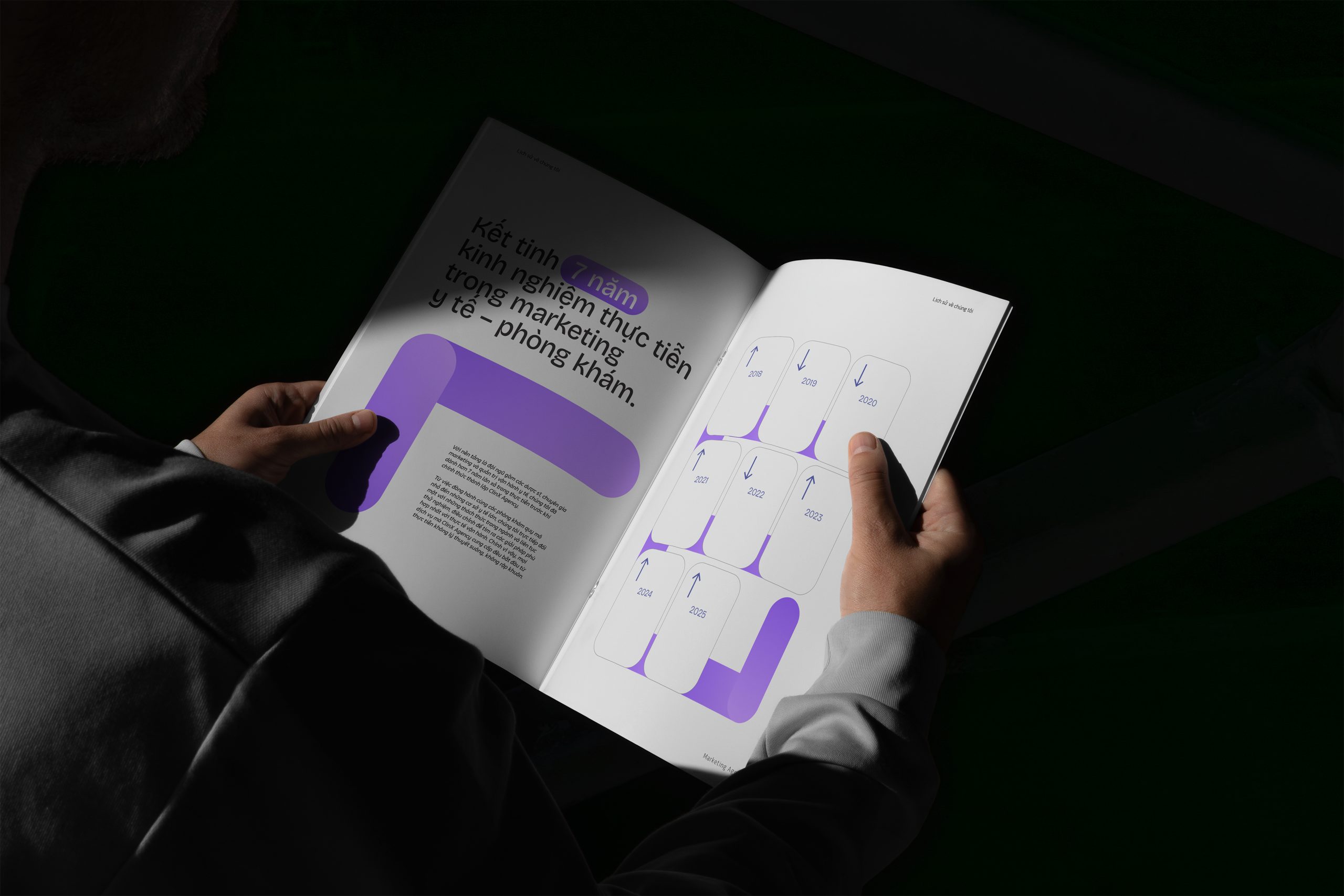
Vietnam’s private healthcare market is growing faster than ever — with thousands of new clinics opening and increasing demand for professional healthcare services. Yet, many still struggle with branding, patient acquisition, and effective marketing operations. Most doctors are excellent at their craft, but often lack the time and expertise to build a strong brand or run their clinics efficiently.
Recognizing this gap, a group of young, passionate creatives with a deep understanding of medical marketing came together to build Clinx Solution — a startup agency specializing in healthcare marketing, on a mission to help clinics grow sustainably through branding, marketing, and operational improvement.
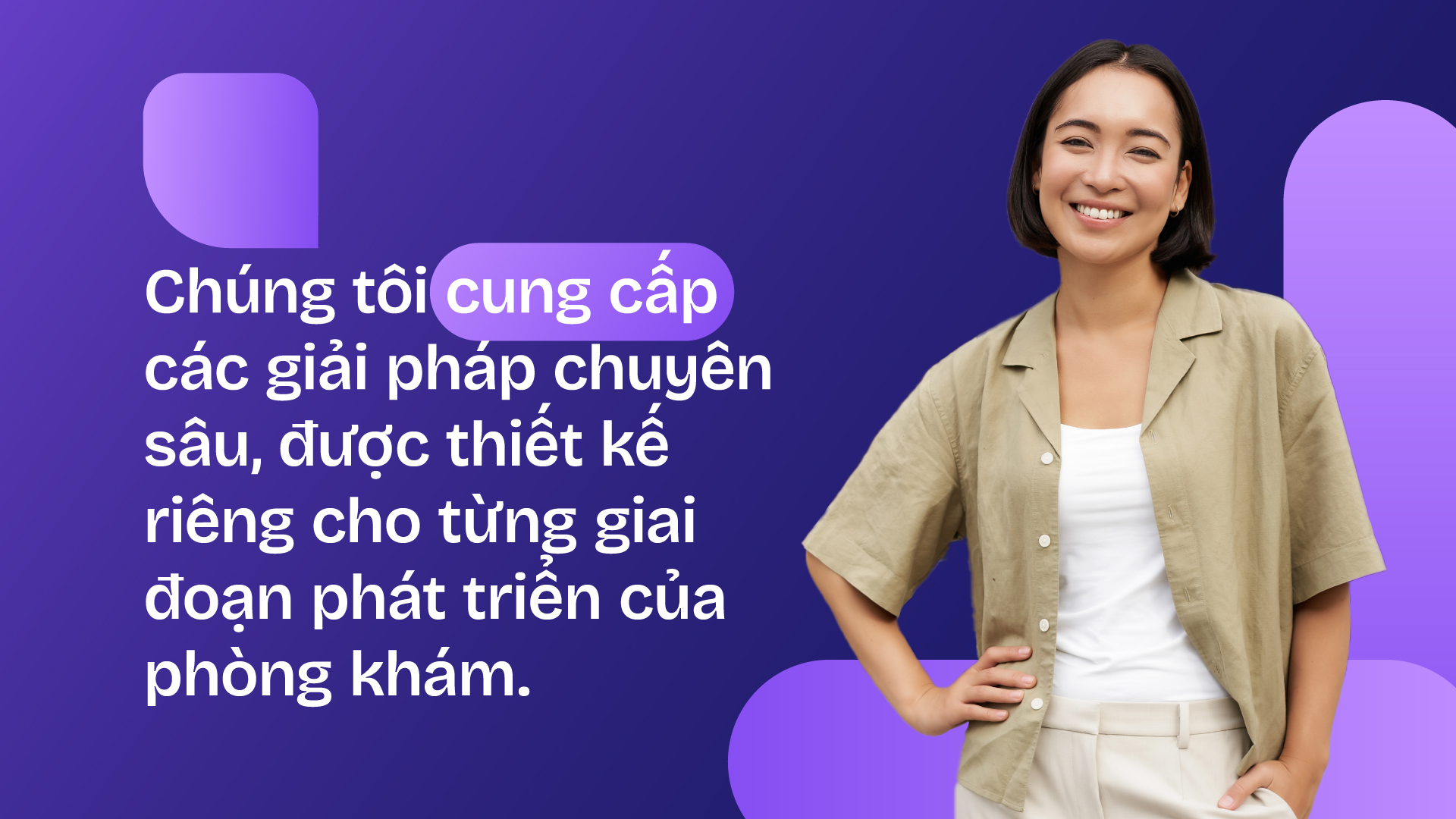
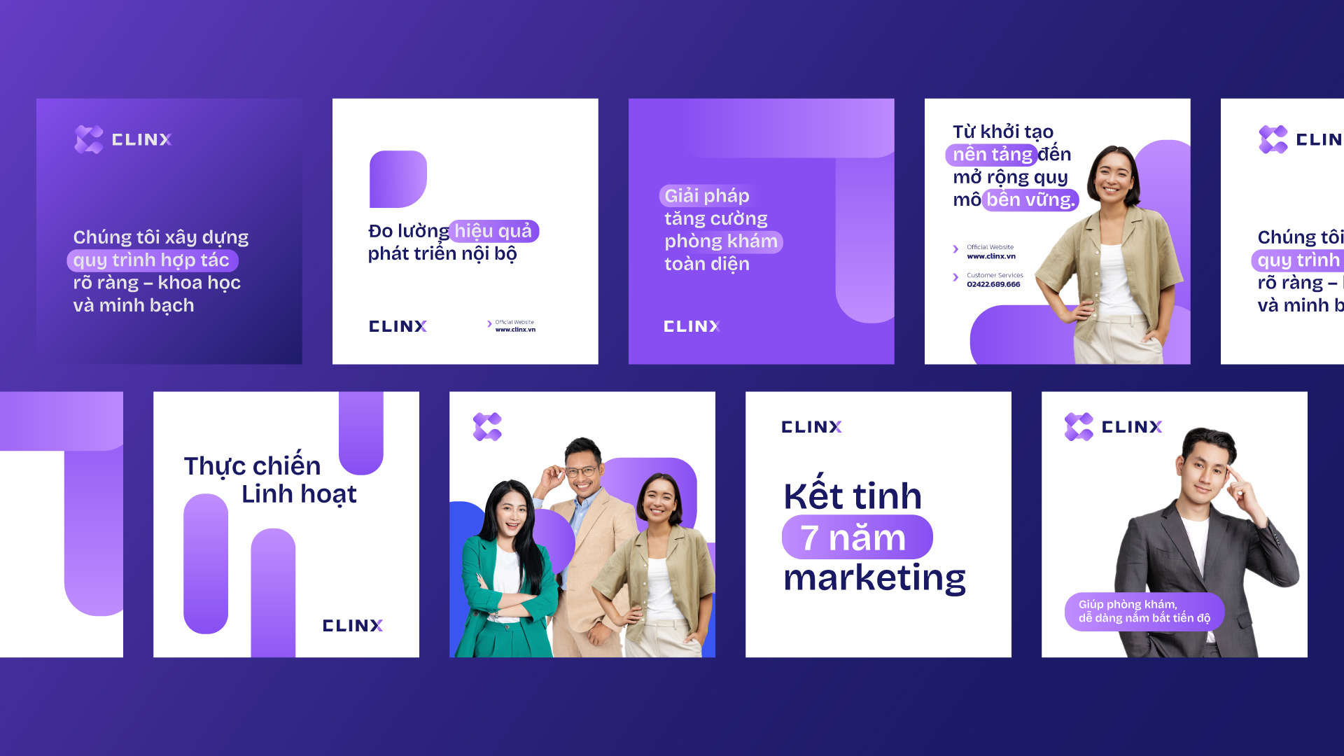
We’re not just another marketing agency — we’re a strategic partner that delivers end-to-end solutions to help clinics build trust, enhance performance, and connect with patients more effectively.
Scope of Work
/ Logo & Brand Identity
/ Logo Guidelines
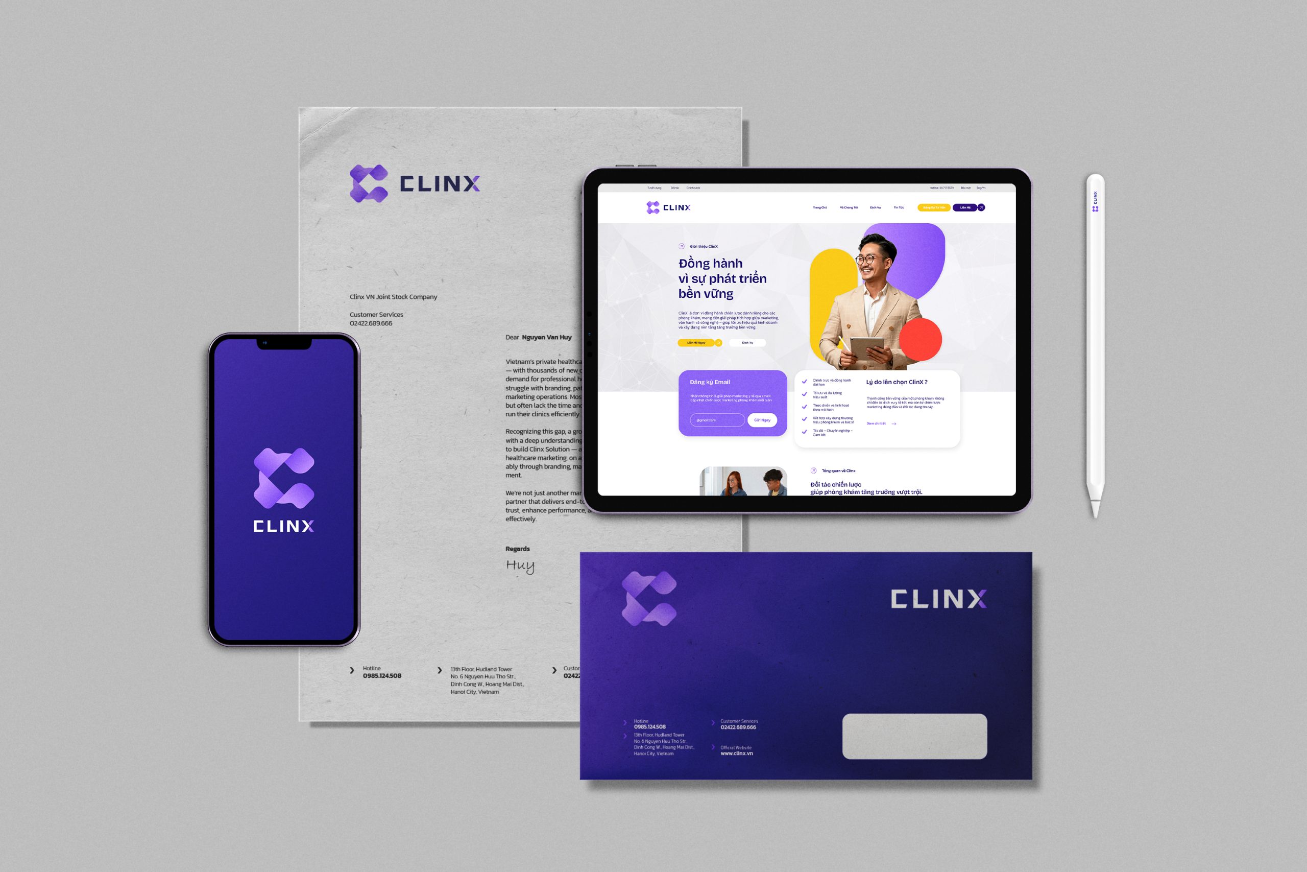
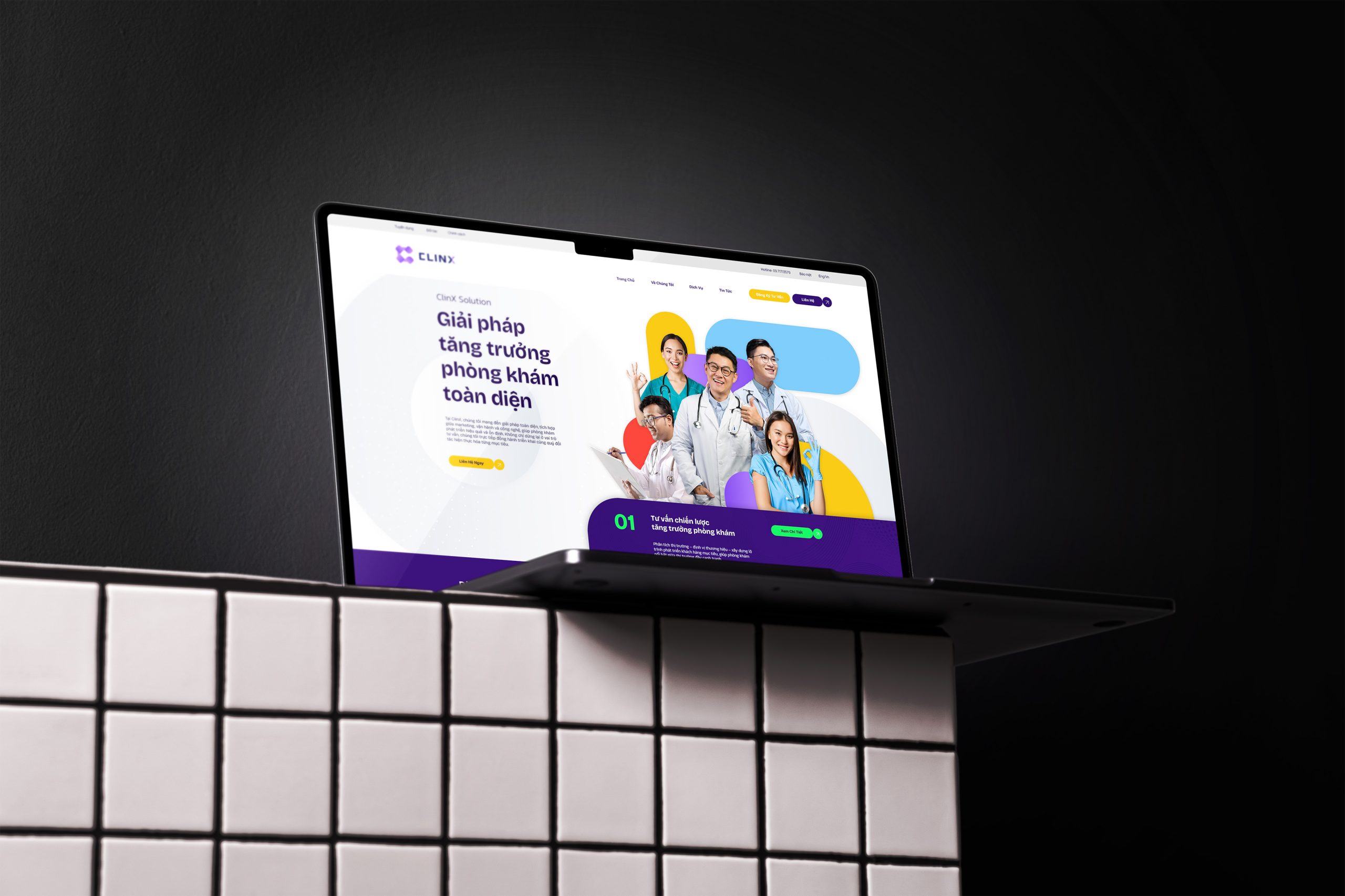
/ Website Design Service
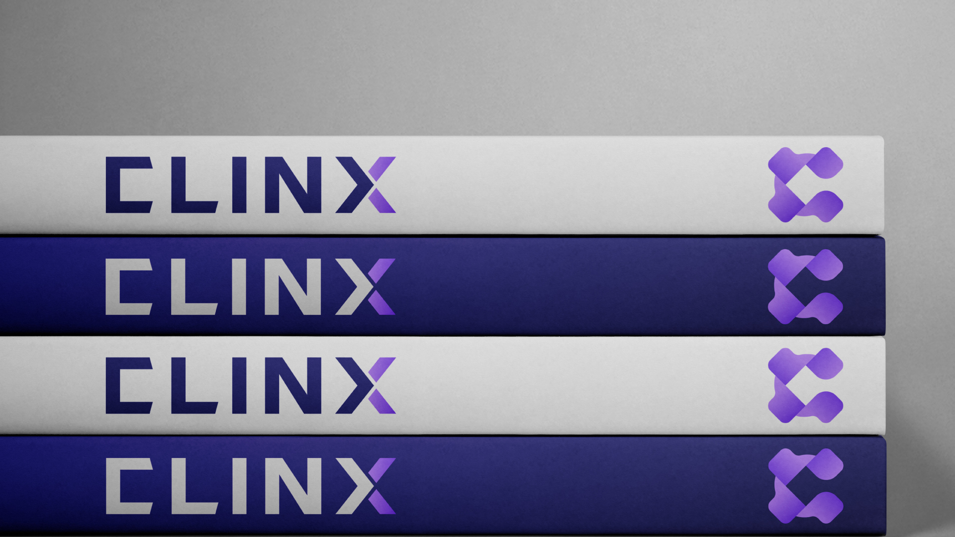
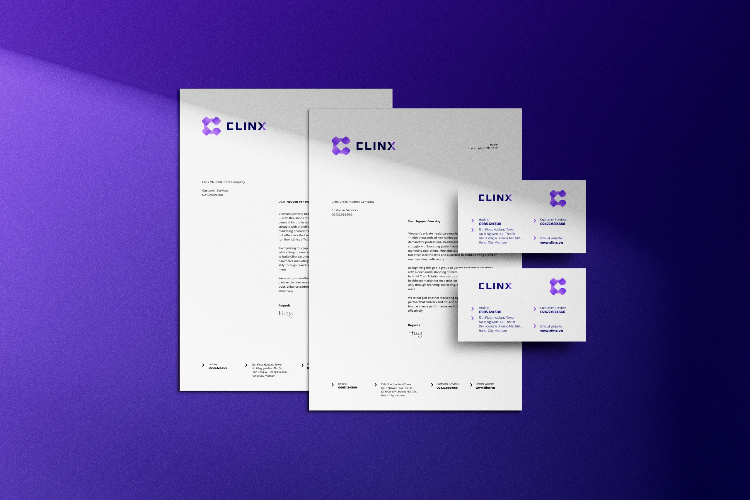
Clinx Agency
Brand Positioning
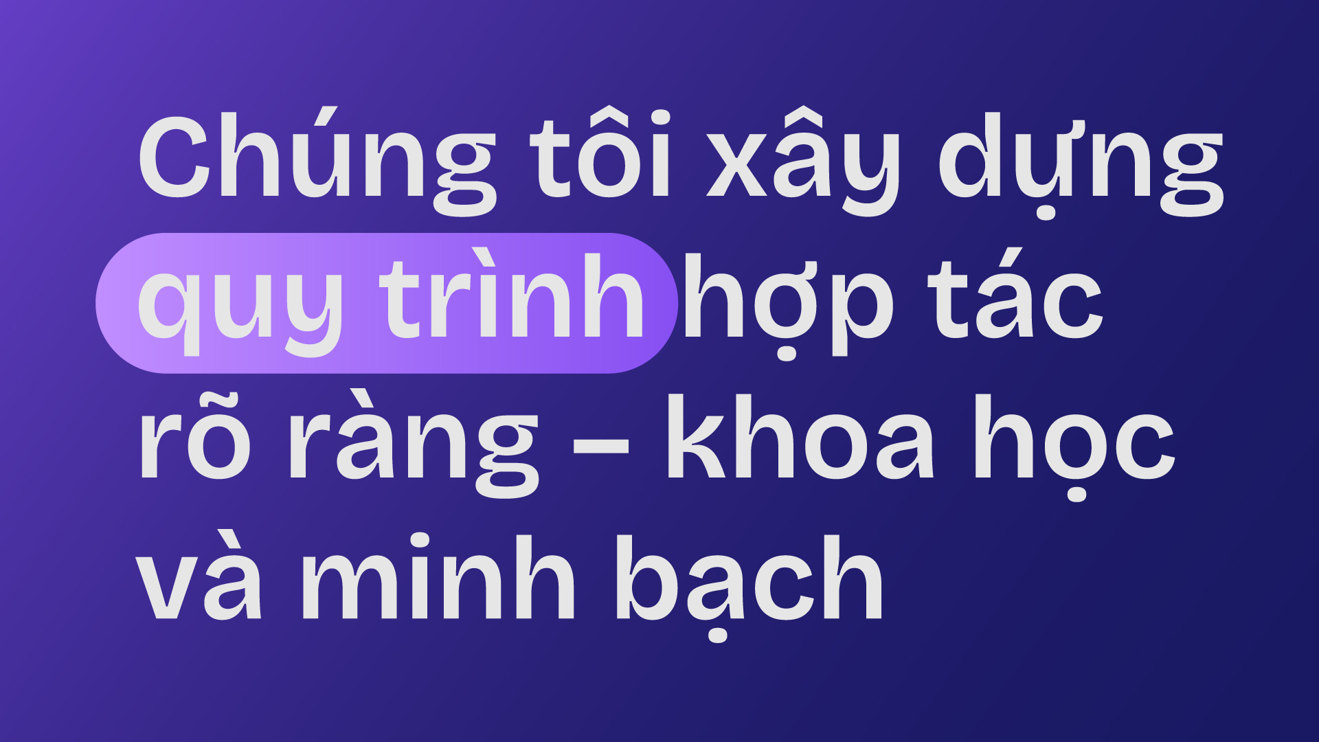
Clinx bridges the gap between healthcare and marketing, helping clinics grow with clarity, efficiency, and trust.
Core Difference → Clinx is a medical marketing agency that understands the industry and clinic operations.
Brand voice → Young – professional – accompanying customers.
Clinx Agency
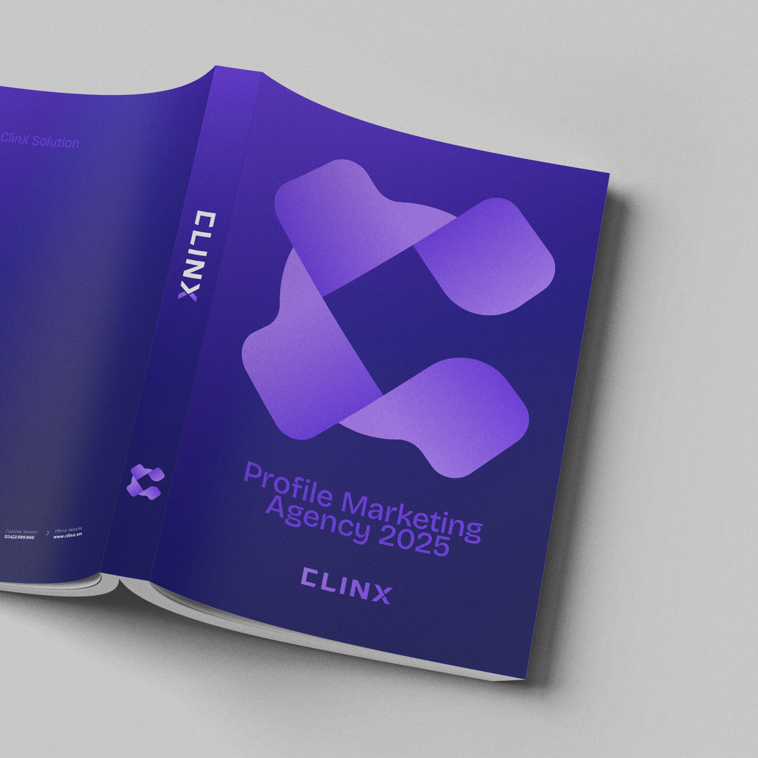
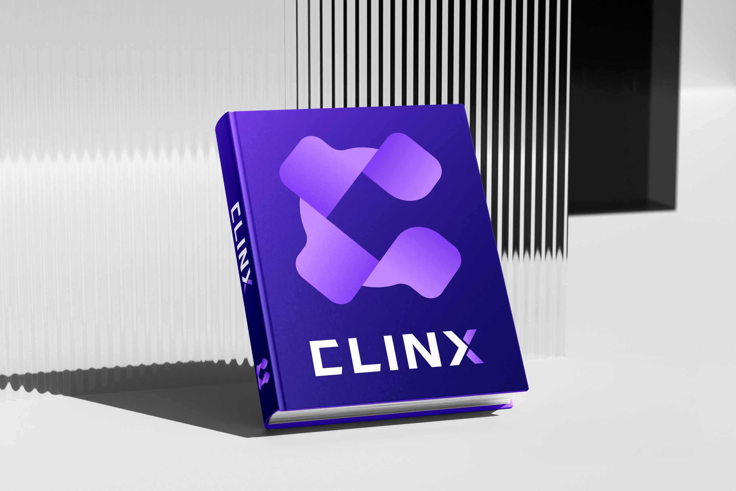
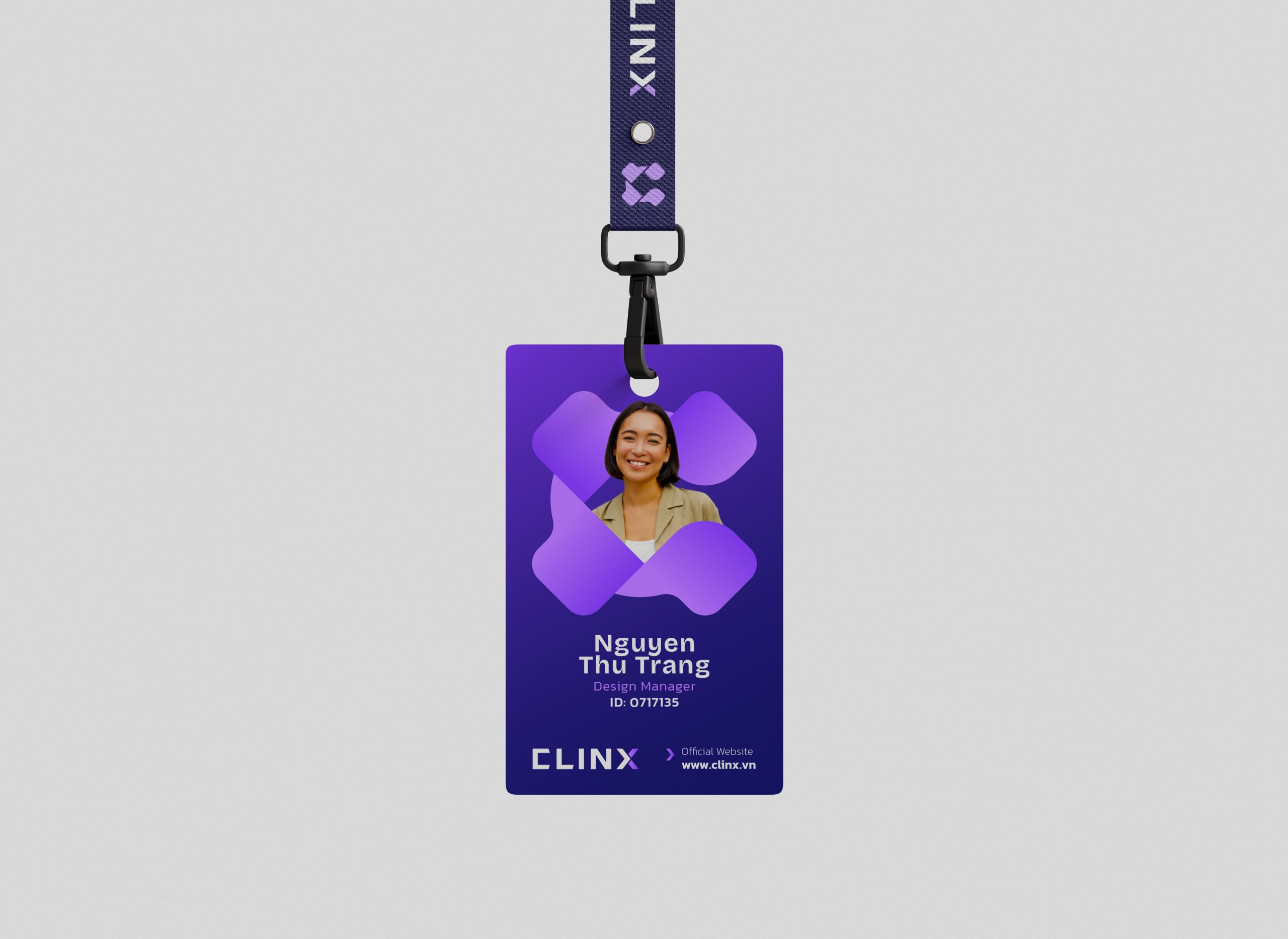
Symbol
1. Interlocking Letters – C & X
→ The C (frontal view) is created from two opposite wings
→ The X appears when looking at the overall intersection – a symbol of the intersection of ideas, the connection between brand and people.
2. Main symbol – Stylized 4-leaf clover
→The symbol consists of 4 rounded petals connected together, forming a 4-leaf clover, Luck – hope – love – faith
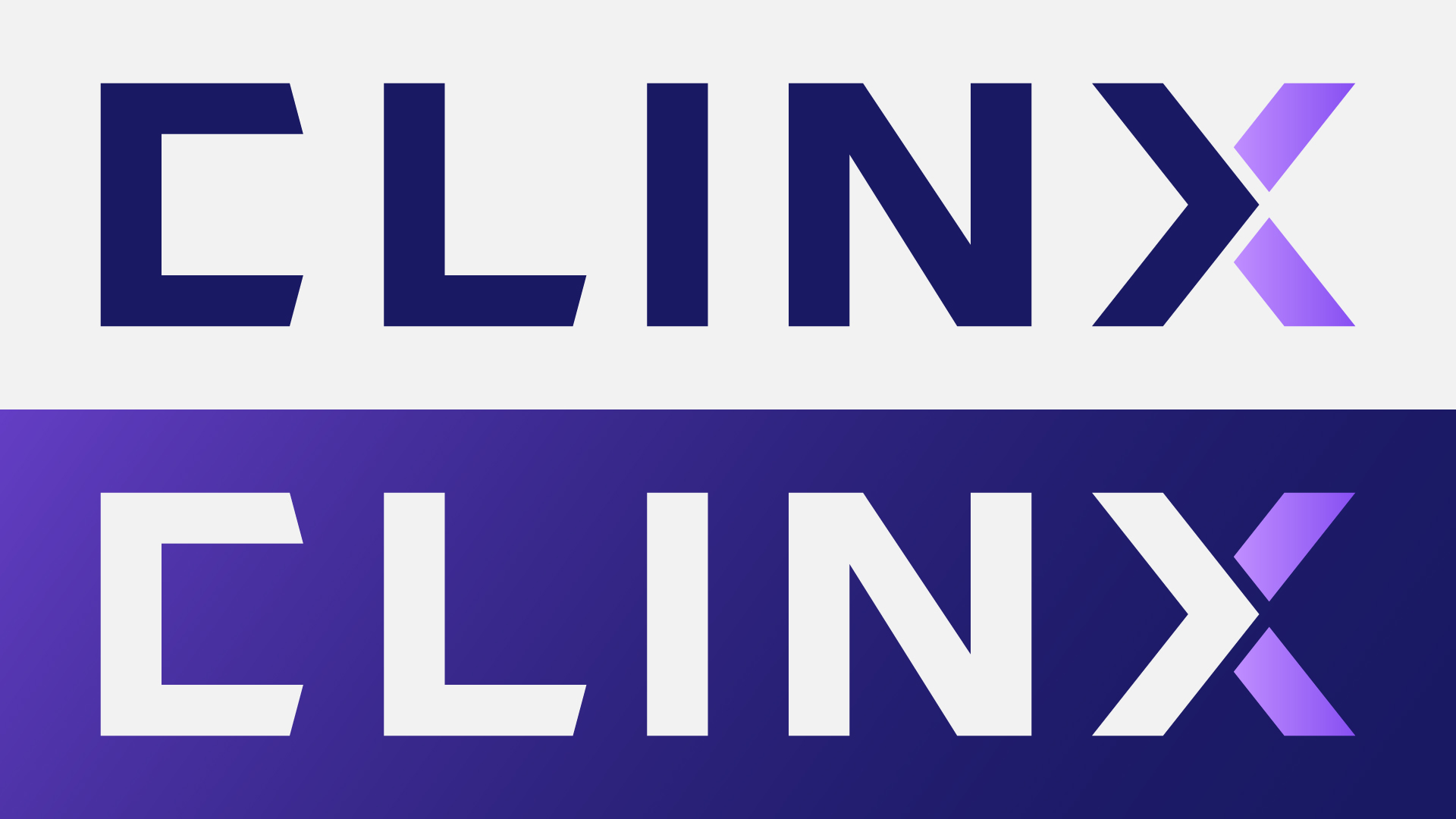
Clinx Agency
Logotype
The final X is a combination of two colors that creates a visual highlight and represents
→ The intersection of ideas and actions, the creative touchpoint where brand value explode
Clinx Agency
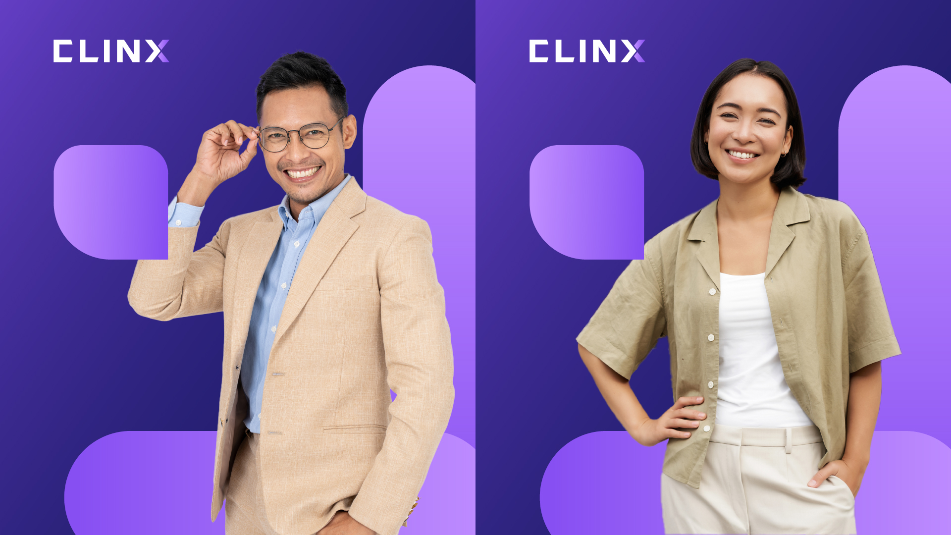
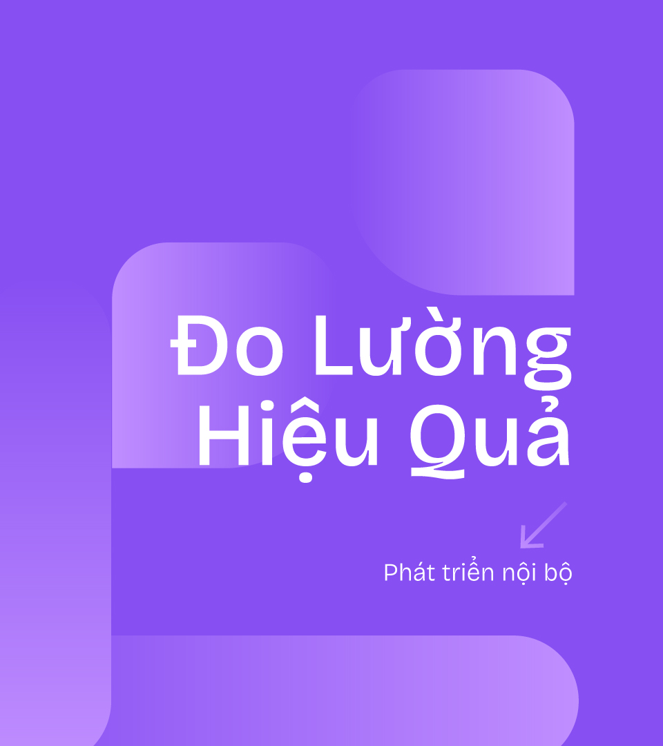
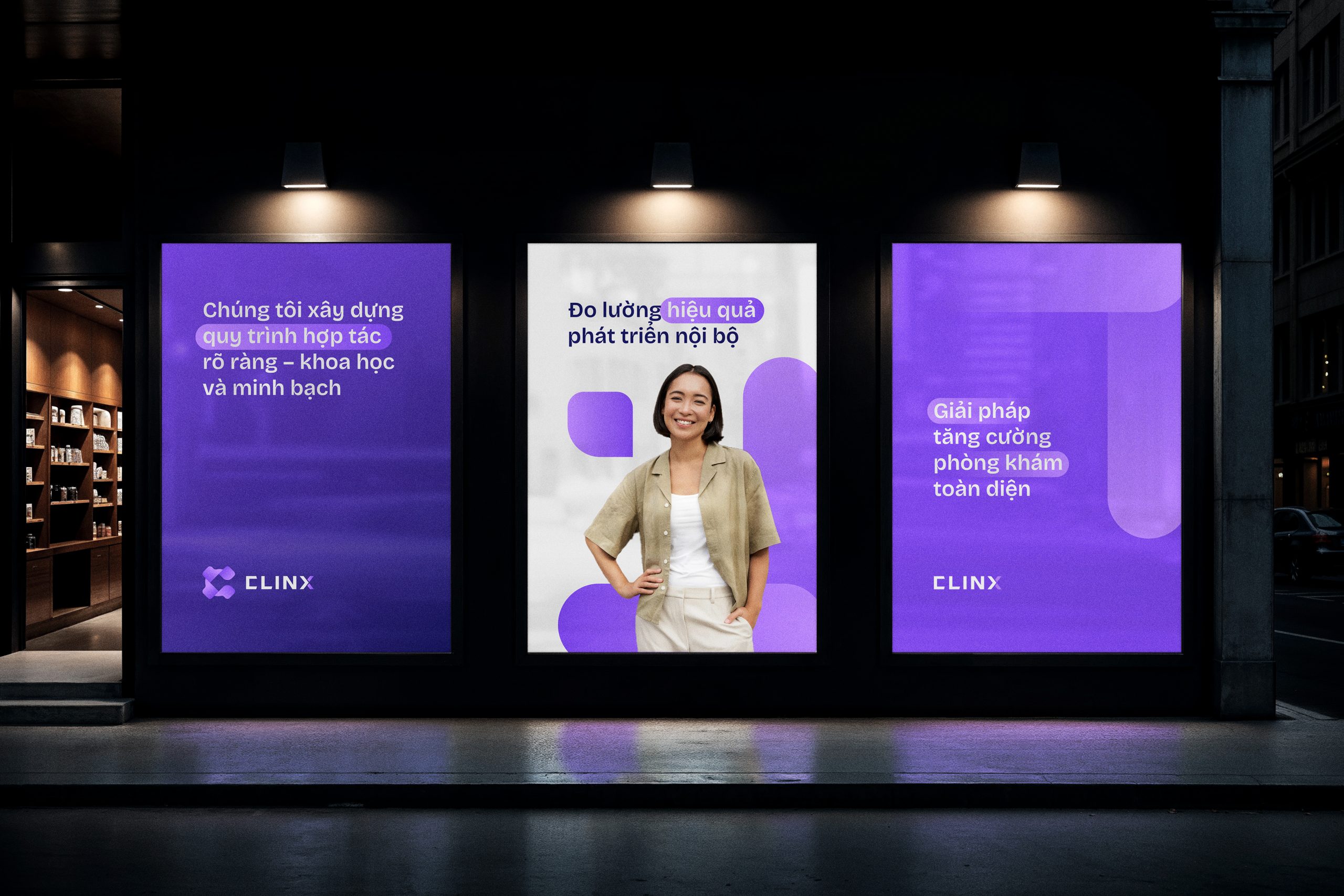
Extended identity
→ The visual motif of Clinx Solution is inspired by a system of rounded, interconnected shapes, symbolizing continuous flow, connection, and optimization — the core principles of modern clinic growth.
→ Its minimal form and signature violet tone represent professionalism, creativity, and digital intelligence, reflecting Clinx’s brand philosophy: “Connect – Understand – Grow.”
→ Beyond aesthetics, this motif embodies Clinx’s mission to bridge healthcare and marketing, merging human insight with data-driven performance.
Clinx Agency
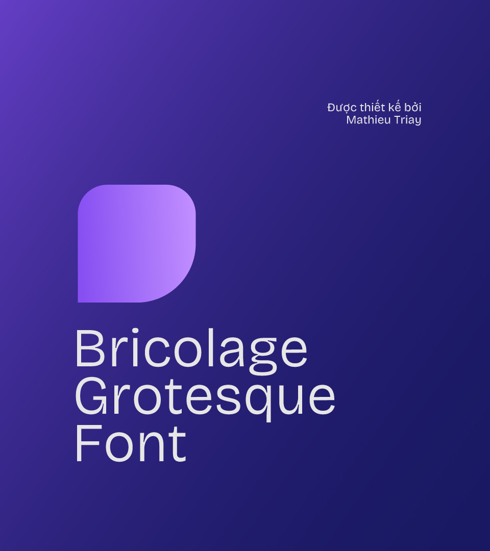
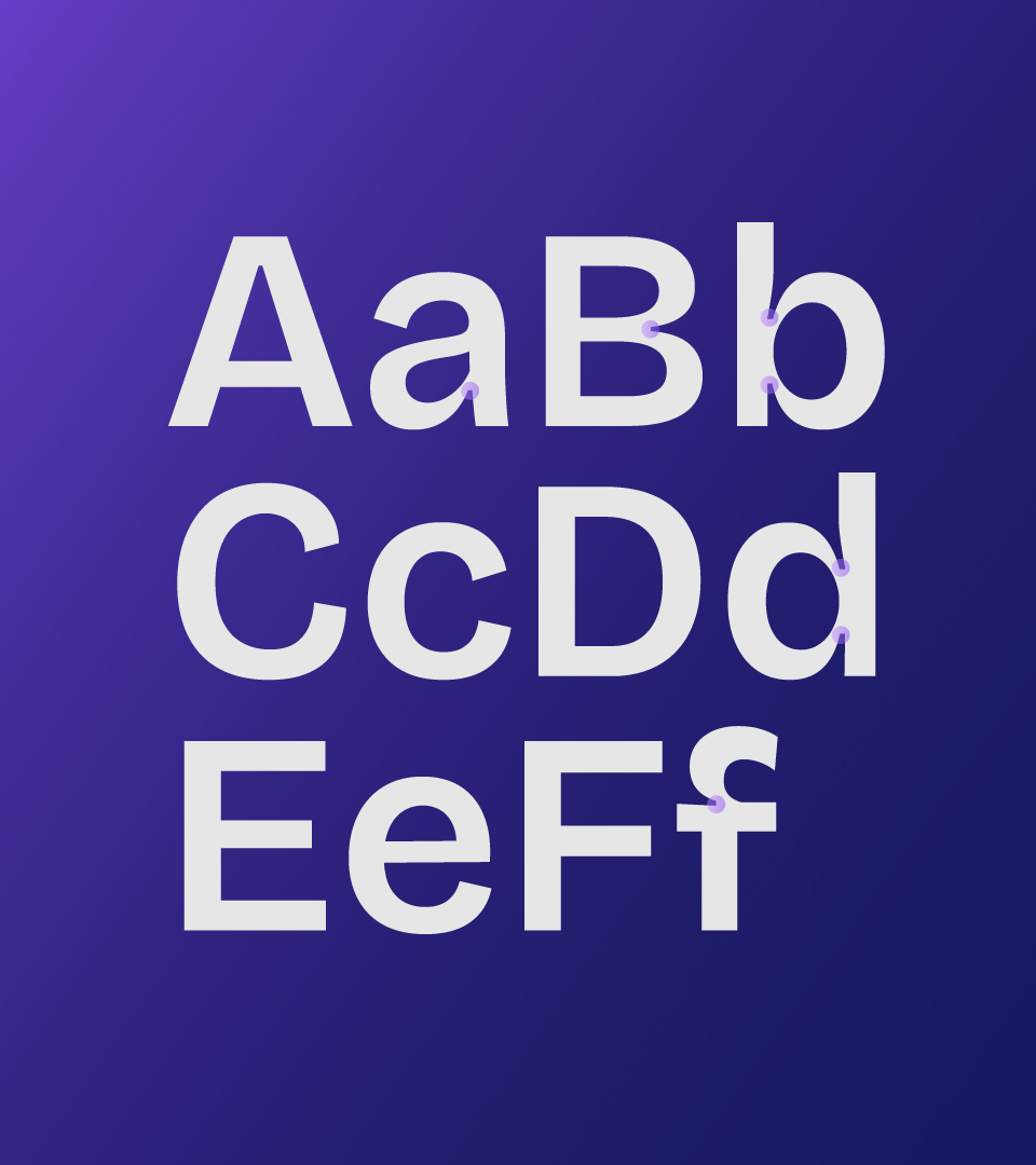
Typography
Bricolage Grotesque font → helps Clinx Solution shape the image of a modern – professional – approachable – creative medical company, connecting two worlds: medical precision and marketing flexibility.
Clinx Agency
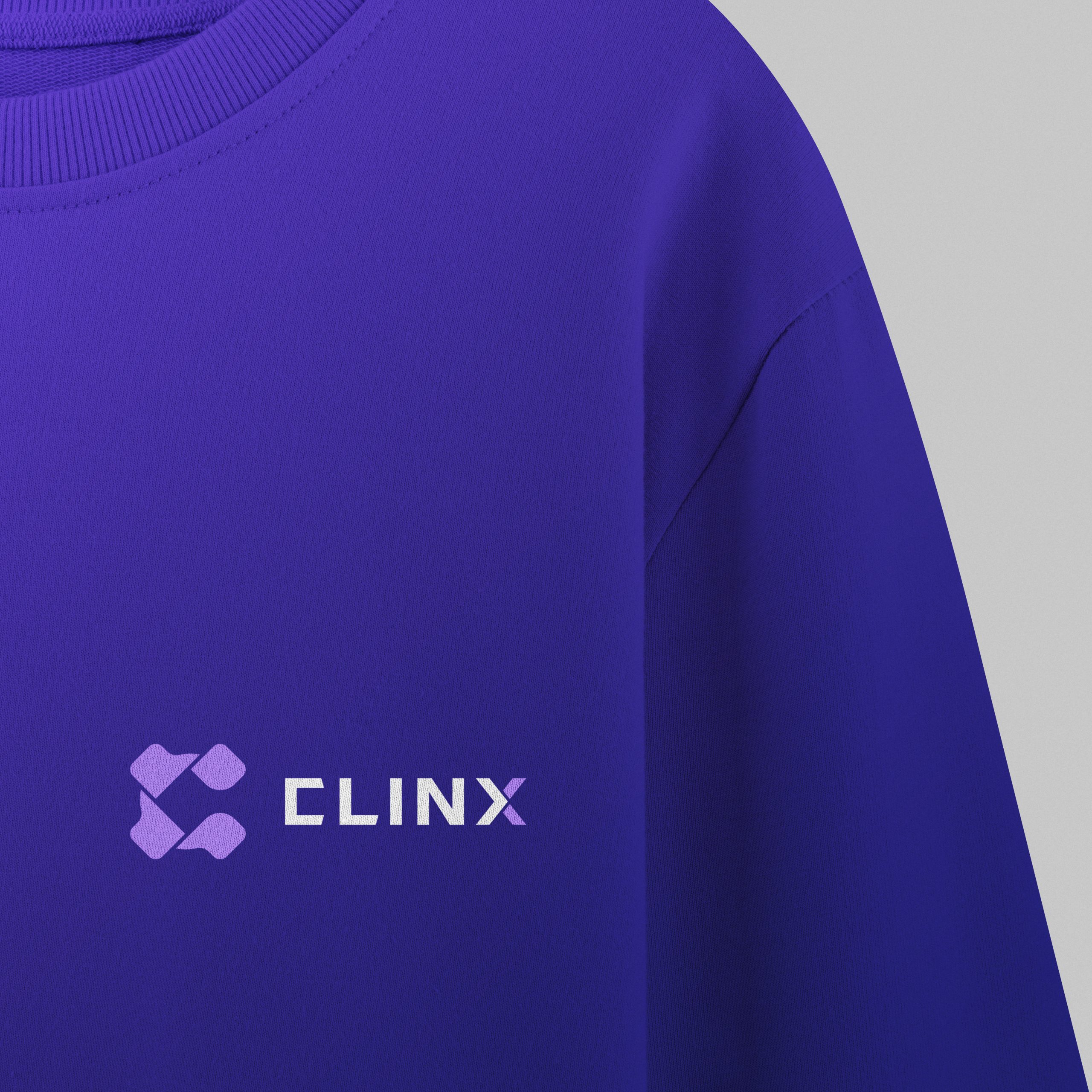
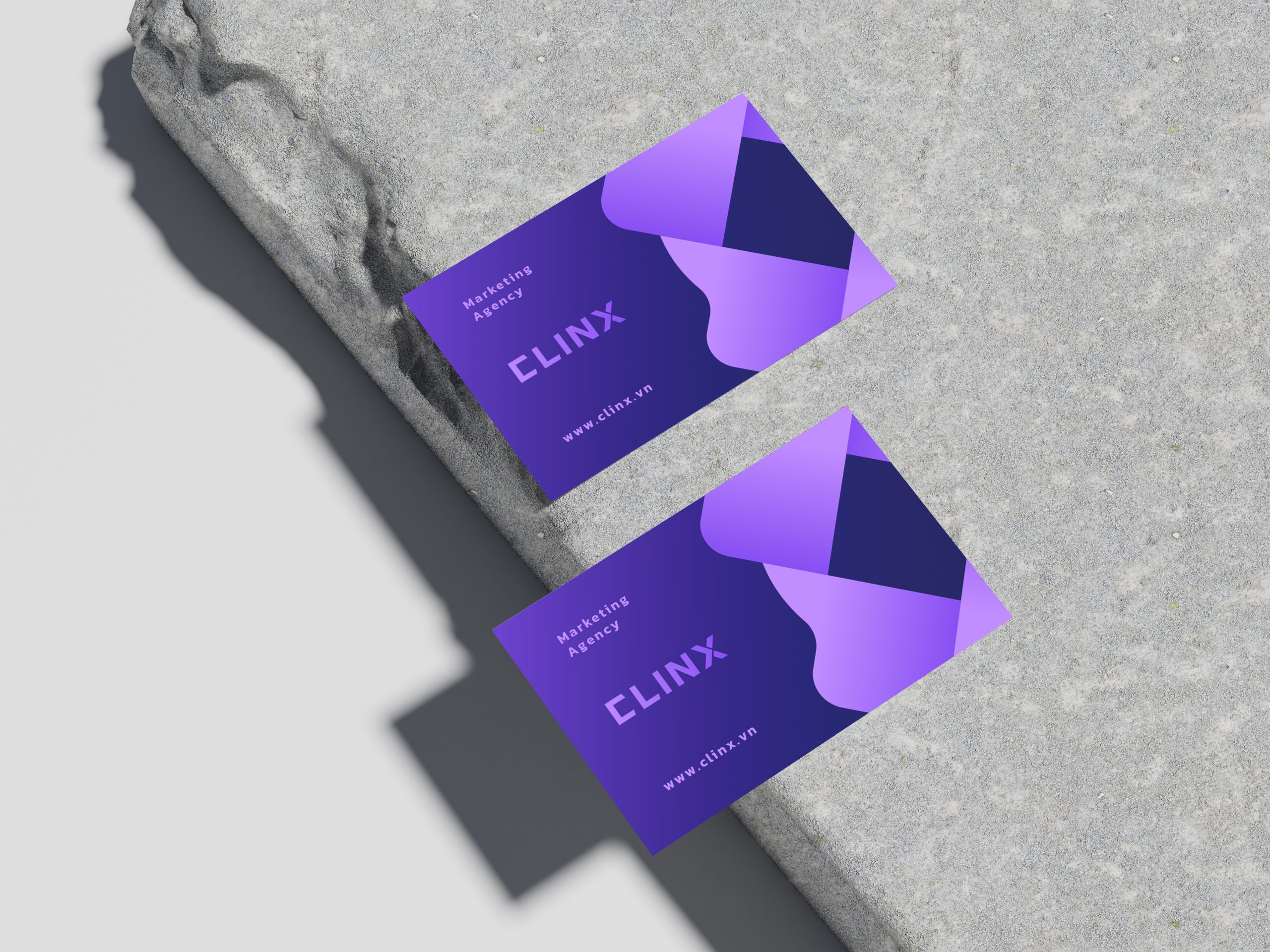
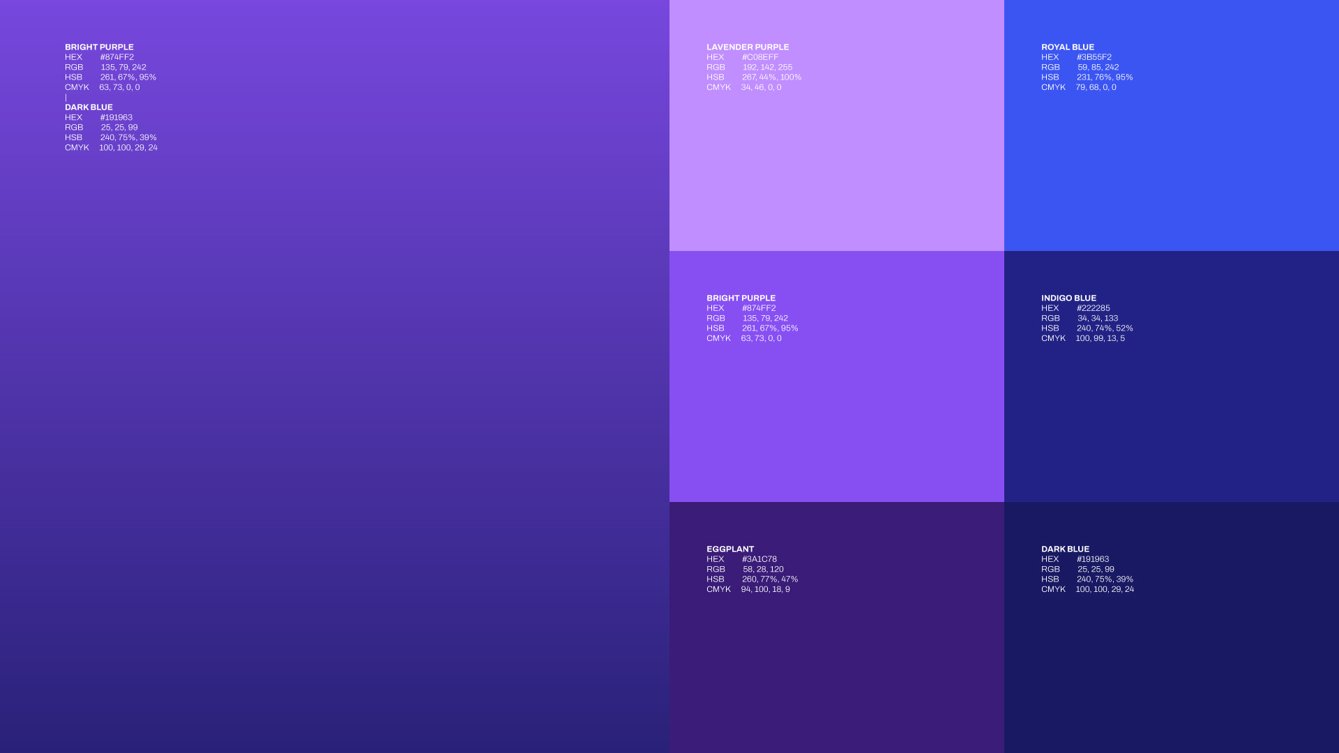
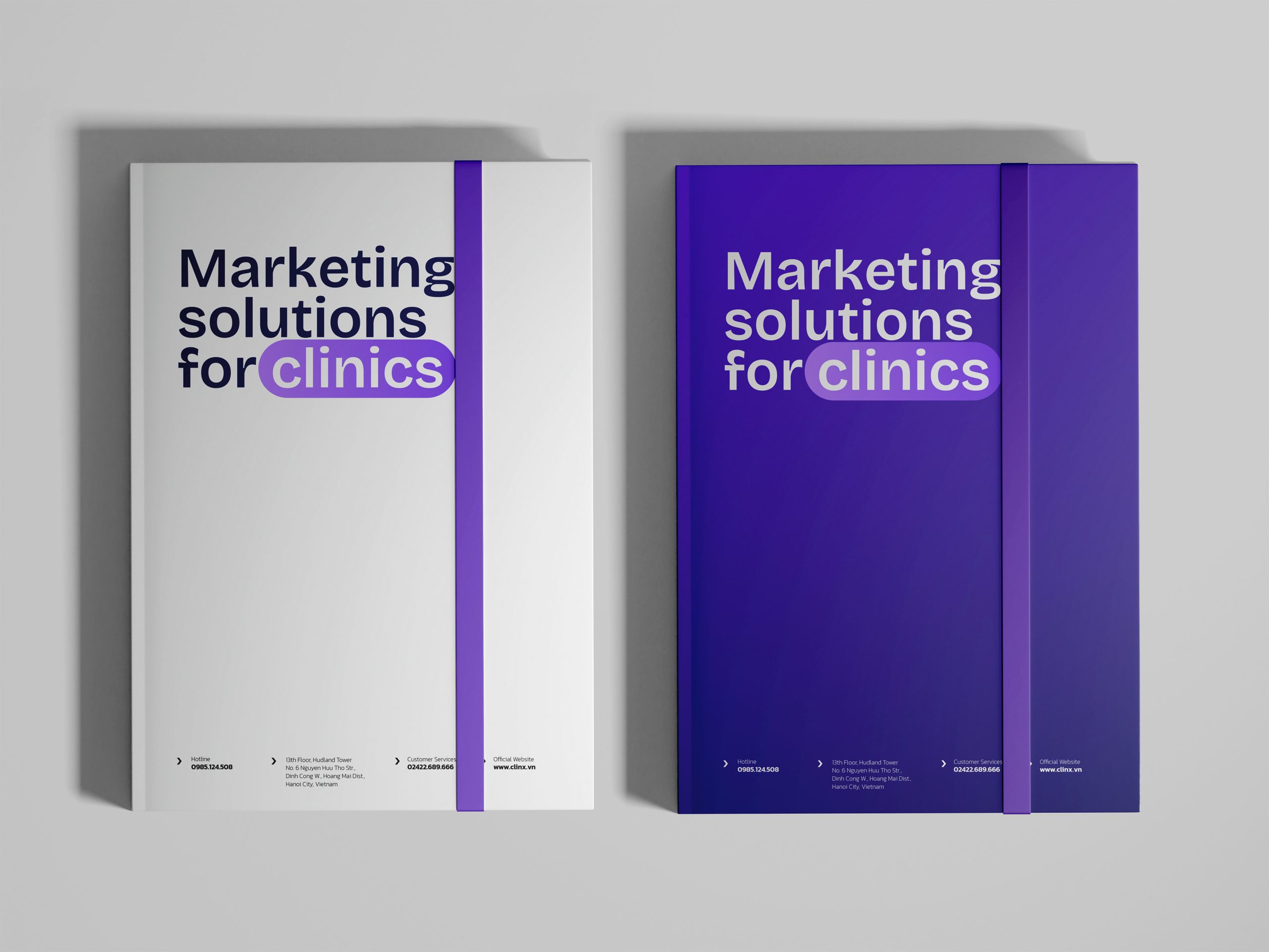
Brand color
Purple Gradient – The Language of Innovation and Strategy → Purple is often associated with creativity, luxury, mystery, and boldness. Purple gradients emphasize adaptability and growth at all strategic levels – from ideas to concrete solutions.
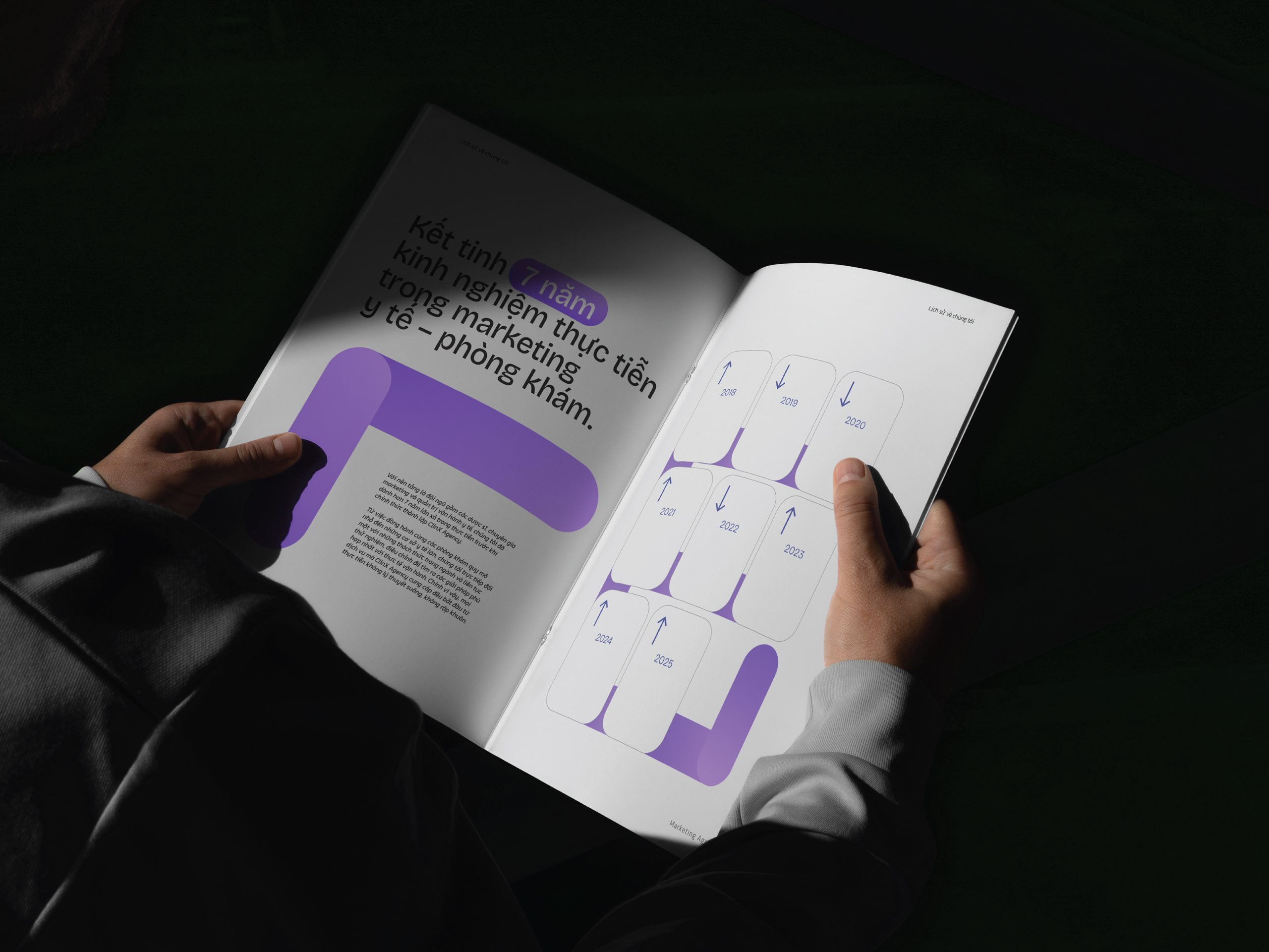
We are delivering brands with high objectives the strategy and the creativity it takes to have that impact, by the professional team with any creativity.